
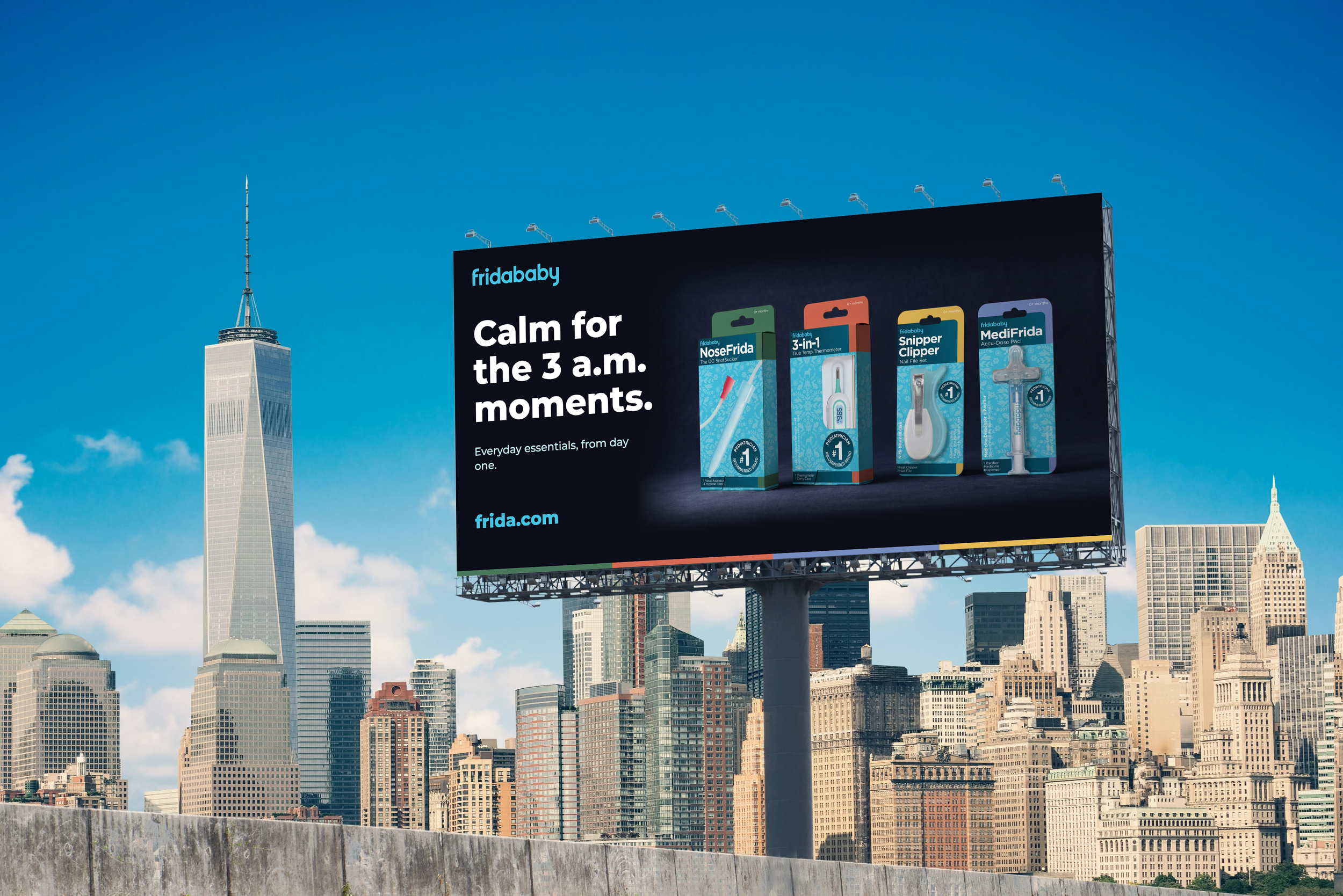

Situation: Fridababy built its identity on irreverent humor and cartoon babies. In February 2026, older packaging and social copy leaning on adult innuendo resurfaced, and parents responded with backlash and boycott calls. The humor that once made exhausted parents feel seen had crossed a line, and the brand needed a visual identity that earned trust instead of laughs.
Task: Redesign the core product line (NoseFrida, 3-in-1 Thermometer, MediFrida and Snipper Clipper) to feel warm, comforting and professional, while clearly distancing the brand from its joke-driven past. The system had to flex across box and blister-card formats and then carry into advertising.
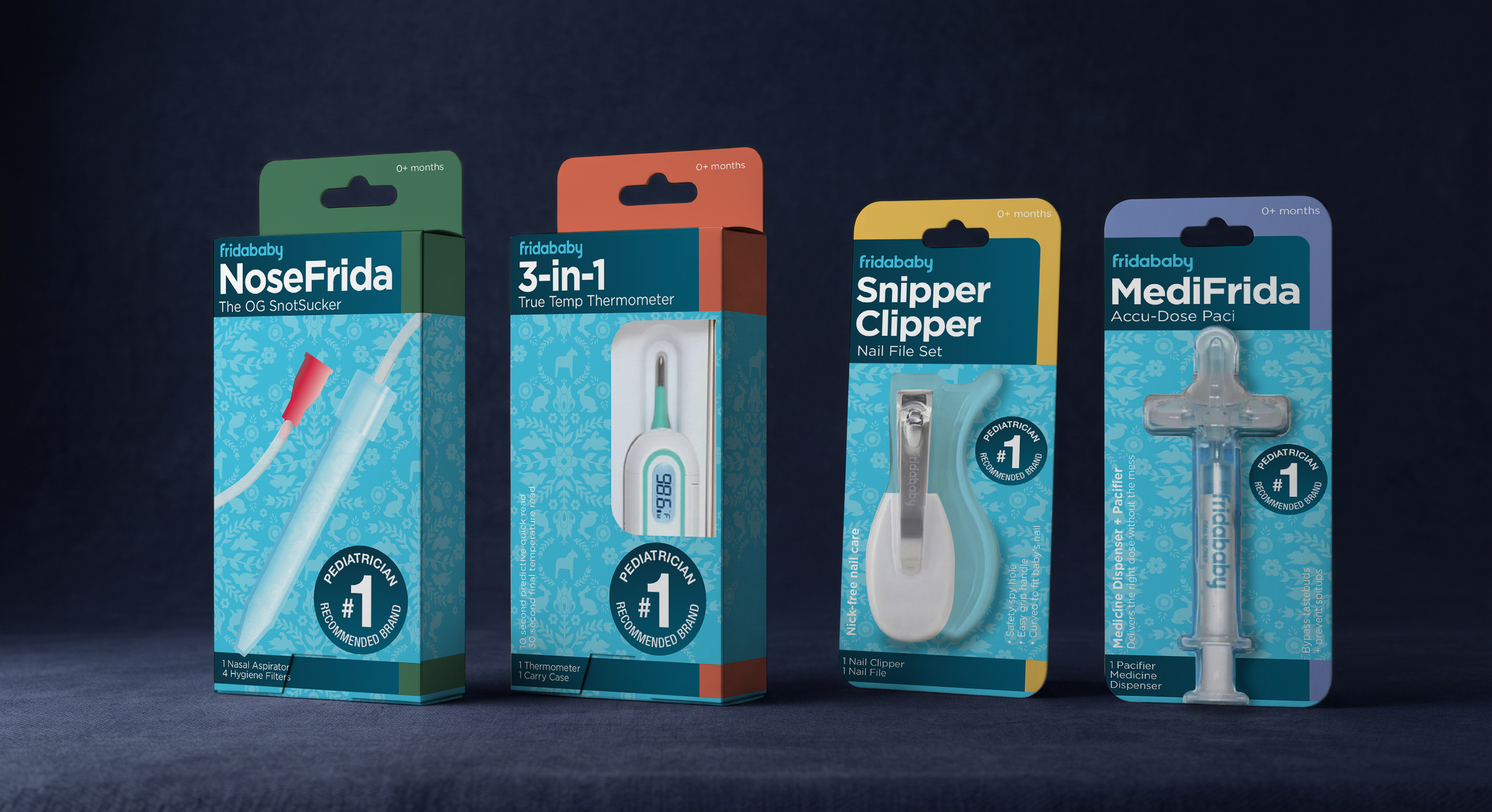
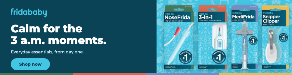
Action: I replaced the cartoon babies with a product-forward system: Frida’s signature sky blue as an ownable field, a deep teal panel for clear information hierarchy, and a color-coded tab for each product so parents can navigate the line at a glance. I developed a custom pattern drawn from Swedish folk embroidery, an homage to the brand’s Swedish roots that adds warmth and craft without a punchline. I audited the work against current children’s OTC packaging trends, restored essentials like age range and contents to the front of pack, and built a campaign voice around reassurance instead of jokes. Finally, I tested the system in context across six standard display ad sizes, desktop, tablet and mobile page placements, and an outdoor billboard.
Result: Delivered a cohesive, credible identity system that moves Fridababy from relatable jokes to relatable reassurance, with strong shelf-blocking, clear product navigation and an ownable pattern. The framework scales from packaging to digital and outdoor, giving the brand one consistent expression wherever parents encounter it.
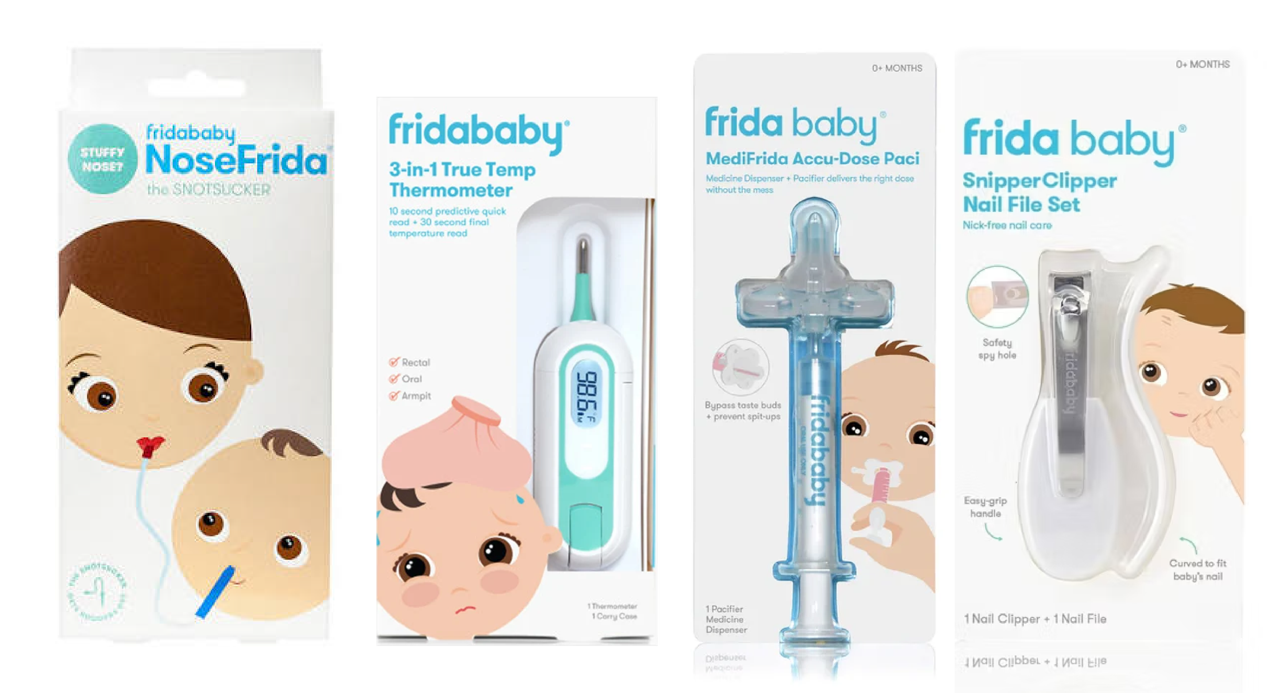
Before
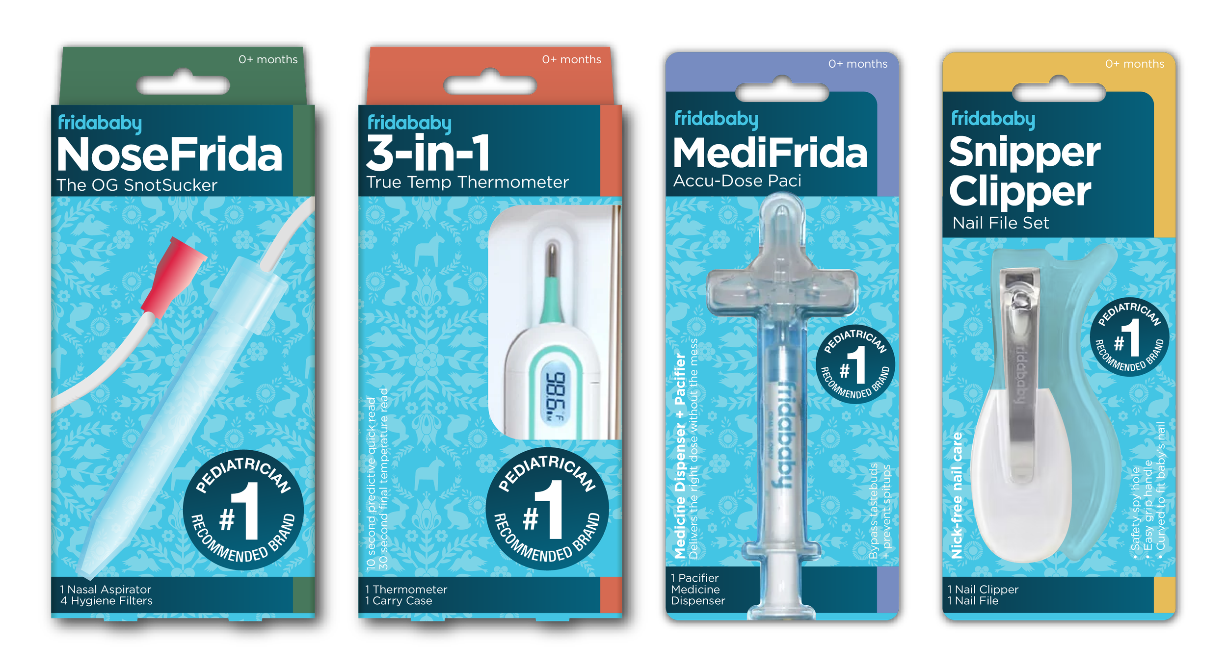
After





Credits

Brand Design
Michael Hoblin